
That's the genius of the DCC - they knew before we did. So they went ahead and designed a new logo.
{And it's not expensive, not wasteful. They're using up the old stationery. Though..... dear reader, it's not all that simple. See below}
"DCC Chief Executive Sue Bidrose says in recent years the organisation has [rhubarb rhubarb rhubarb]
“More recently we have been working on how we can improve communications with our community. A strong brand sets out an organisation’s intention to connect with its customers on a personal level...."
I'm feeling so connected now, aren't you? I'm no longer in doubt about what they are and what they do, reassured by the new logo, colours and fonts which signify a professional, warm and inclusive image. [https://www.dunedin.govt.nz/news-and-events/news/may-2019/dcc-announces-new-brand - thanks for the giggles]
Brochures and business cards. New logo on vehicles.
But wait, there's more!
All staff who are out and about interacting with the public have to have new clothes with the new logo on them. ShirtS and jerseyS - plural, per person. These are well-made garments, not cheap tee shirts made to last only through Bollard Relocation Week. Will the good shirts and smart warm jerseys be donated to thrift shops or are they destined for landfill so unworthy types can't masquerade as DCC employees?
The DCC's new logo.
- John Sinclair
https://www.odt.co.nz/news/your-news/new-dcc-logo
He's not wrong :

-----------------------------------------------------
Thursday, 16 May 2019
DCC launches new logo
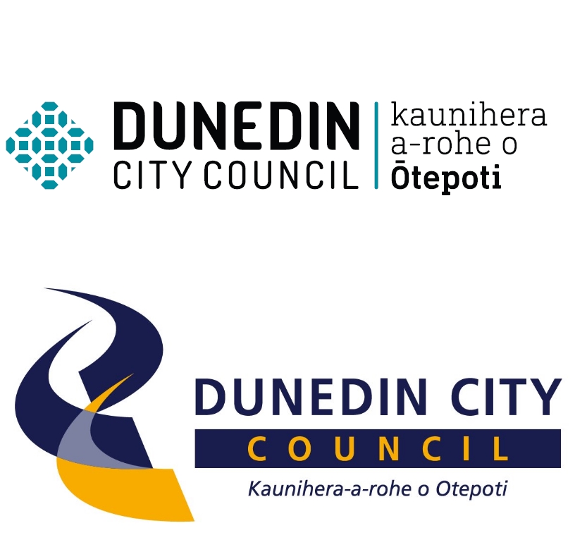
The Dunedin City Council has a new logo (pictured top) after using the old one (bottom) for 14 years.
...DCC chief executive Sue Bidrose said the new brand included the
literal Māori translation for the DCC – kaunihera a-rohe o Ōtepoti – and
had been endorsed by the Māori Participation Working Party. 😇
DCC communications and marketing manager Graham McKerracher said the
new brand did not include a slogan
and the move away from the blue and gold gave the DCC its own strong visual identity.
The new branding would appear immediately in some areas,
such as on the DCC website,
but would be rolled out over time in others, such as brochures and business cards.
The initial costs were expected to be about $23,000 and would be
met from the existing council communications and marketing budget.
The new brand was developed in-house by the marketing and design team to mitigate external costs.
https://www.odt.co.nz/news/dunedin/dcc-launches-new-logo
CommentS on ODT site:
Rtn2Dun
Thu, 16/05/2019 - 1:56pm #
Why
the change? How does it - better reflect who we are and what we do,
What are the true costs - Changing current stationary, logos, on cars,
trucks, buildings, The older one is better and has the colours linked
to Otago.
because_science
Thu, 16/05/2019 - 3:05pm #
The
font and Te Reo are nice, but the image? It looks like a morrocan tile -
how does it have any significance to Dunedin at all? Any generic logo
creator on google could have come up with this or better. Did DCC do any
market testing or did they ask their 500+ employees their opinion
before choosing a design, surely they would have brought up some
suggestions.
-----------------------
-----------------------
From Facebook
https://www.facebook.com/DunedinCityCouncil/posts/the-dcc-has-a-new-brand-thats-more-contemporary-creative-and-versatile-it-replac/2280695331976132/
Dunedin City Council Hi
Andy, the new logo represents the DCC and the work the council does,
whereas the boundary signage is the city’s Gothic Dunedin brand.
The new logo works with and sits alongside the Gothic Dunedin brand. We work in partnership with the Dunedin brand, however, the Dunedin brand is used by many other stakeholders and businesses, as was intended, to promote the city, but the Gothic brand alone does not allow visibility or acknowledgment of the work the council does for the city and its community, the new brand will.
The new logo works with and sits alongside the Gothic Dunedin brand. We work in partnership with the Dunedin brand, however, the Dunedin brand is used by many other stakeholders and businesses, as was intended, to promote the city, but the Gothic brand alone does not allow visibility or acknowledgment of the work the council does for the city and its community, the new brand will.
Asuma Abu-Zafar I
don't agree with this sentiment. I think that the previous DCC logo was
more noticeable - you could look at it from a distance and recognise it
as the DCC logo for its colours and shapes. It may have been old, yes,
but it did its job. Meanwhile, this logo
may look "contemporary" but in no way does it look like anything more
than a cluster of geometric shapes. What's the point in changing the
logo to something people will be less likely to recognise, simply
because the previous one is old?
- Jeremy Trotter Intrigued to know what the rationale is in a public body for branding related activities akin to the kind of marketing that belongs only in a competitive product/service environment. It’s not as if we have a choice which rating body we pay to. Initial costs were $23k, but what about the salaries and other costs of the internal marketing staff? I’ve just moved from Lower Hutt, which itself is not immune to profligate council spending, and a little disappointed that DCC hasn’t broken the mould.
Philip Ward Exact same pattern as the floor lino in a '79 Zephyr caravan...hahahahahahah i used to build them. 😂😂😂🤣🤣🤣. Life eh!!!, wot a fkn joke, $23k strewth, 🧐🤓.
No comments:
Post a Comment
Comment here: